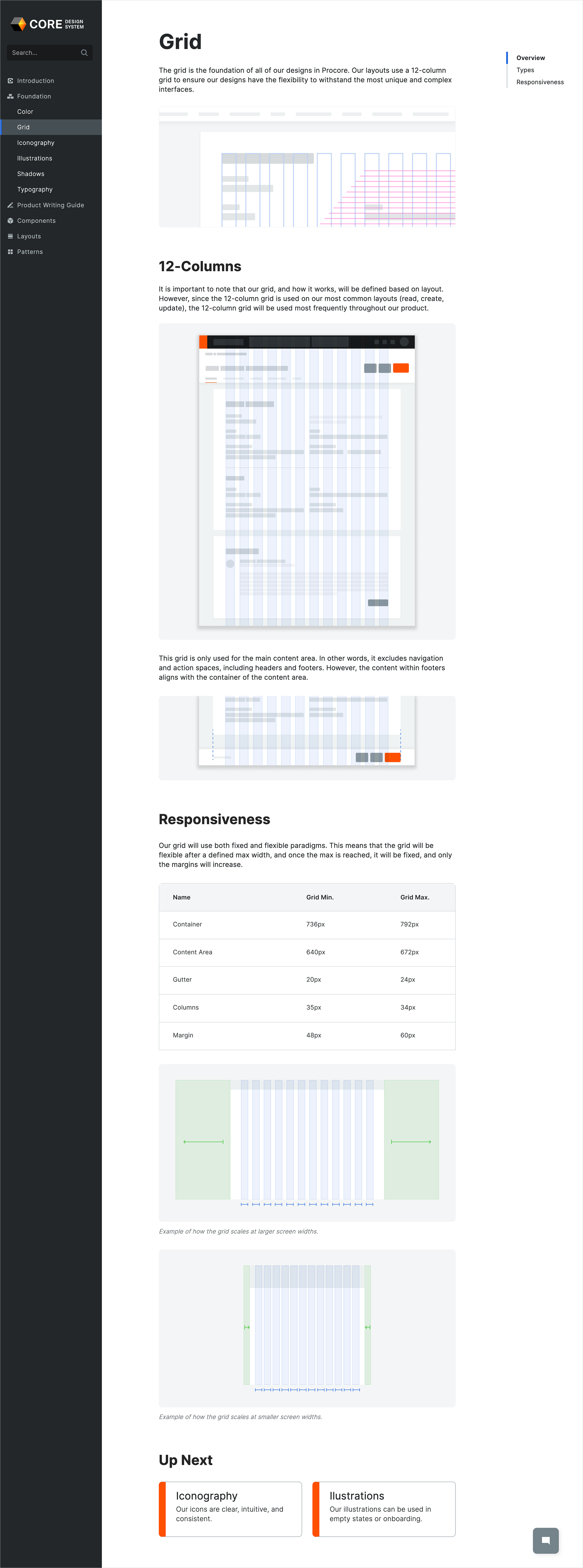
View the live site here: www.design.procore.com
Background
Procore Technologies, the world's leading construction management software company, recognized the need for a unified design system to streamline their user interface across various products. The goal was to ensure consistency, improve usability, and foster a cohesive brand identity.
Challenge
The challenge was to develop a design system that could serve as a guiding framework for all areas of the Procore application. It needed to simplify decision-making processes, reduce conflicts among design teams, and align with engineering for seamless implementation.
Solution
The CORE Design System was was introduced as a comprehensive framework built on foundational philosophies to guide design decisions. The system was meticulously crafted to ensure consistency, enhance usability, and reinforce the Procore brand identity.
A set of guiding design principles to inform design decisions, focusing on user-centricity, accessibility, and scalability. A library of reusable UI components was created, including buttons, forms, navigation elements, and more. Each component was designed with flexibility and adaptability in mind, allowing for easy customization to fit various use cases.
Documentation of best practices were defined for design implementation, including spacing, typography, color usage, and interaction patterns. This served as a reference guide for designers to maintain consistency and coherence across the platform.
Implementation
To facilitate adoption and usage, a dedicated website (www.design.procore.com) was created to host the CORE Design System documentation. The website provided easy access to design principles, UI components, and best practices for all Procore designers. Additionally, we integrated the design system directly into Figma, allowing designers to access and use the components seamlessly within their design workflow.
Results
The implementation of the CORE Design System resulted in significant improvements in the user experience of Procore's products. By providing a unified framework for design decisions, the system helped reduce conflicts and streamline the design process across teams. Engineers also benefited from the alignment with coded React components, leading to faster and more efficient implementation of designs. Overall, the CORE Design System has played a crucial role in enhancing the usability, consistency, and brand identity of Procore's software products.

